Notes
-
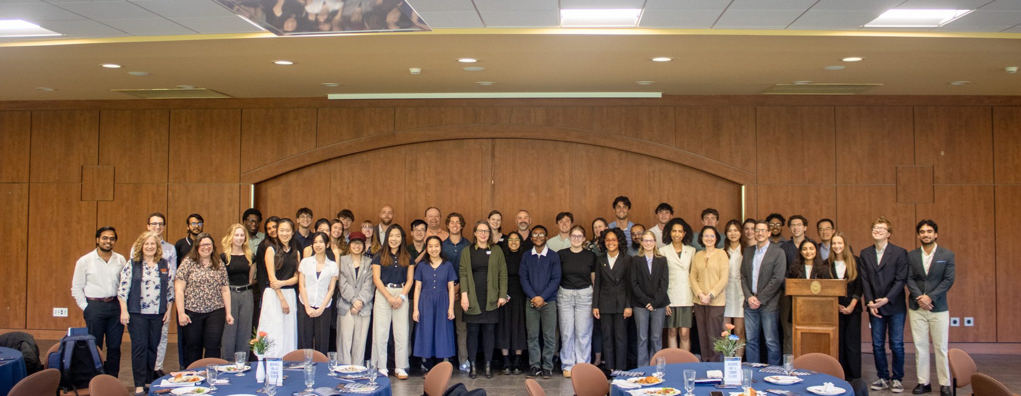
Spring 2026 JoAnn Patrick-Ezzell ’75 & Andrew Ezzell Data Science Student Fellows Showcase
Congratulations to all of the Spring 2026 Data Science Student Fellows! On April 27, 2026, 38 students presented their 16 data and AI projects in the Spring ’26 Showcase for the JoAnn Patrick-Ezzell ’75 & Andrew…
-

Data Science in the Age of AI: AI is the Engine & You are the Engineer
By Sophie Yang ’27 The Dominguez Center for Data Science recently hosted an engaging talk by Dr. Chester Ismay, who shared how generative AI tools are transforming complex data science projects. He highlighted how data science…
-

Dedication of the Dominguez Center for Data Science and the Perricelli-Gegnas Center for Entrepreneurship & Innovation
(left to right) Lisa Belcher, Eric Belcher, John Reynolds, Mike Maiolo, Michael Dominguez, John Bravman, Scott Perricelli, Sue Gegnas Perricelli, JoAnn Patrick-Ezzell, and Jim Bolognese On Wednesday, October 22, 2025, the Dominguez Center for Data Science…
-
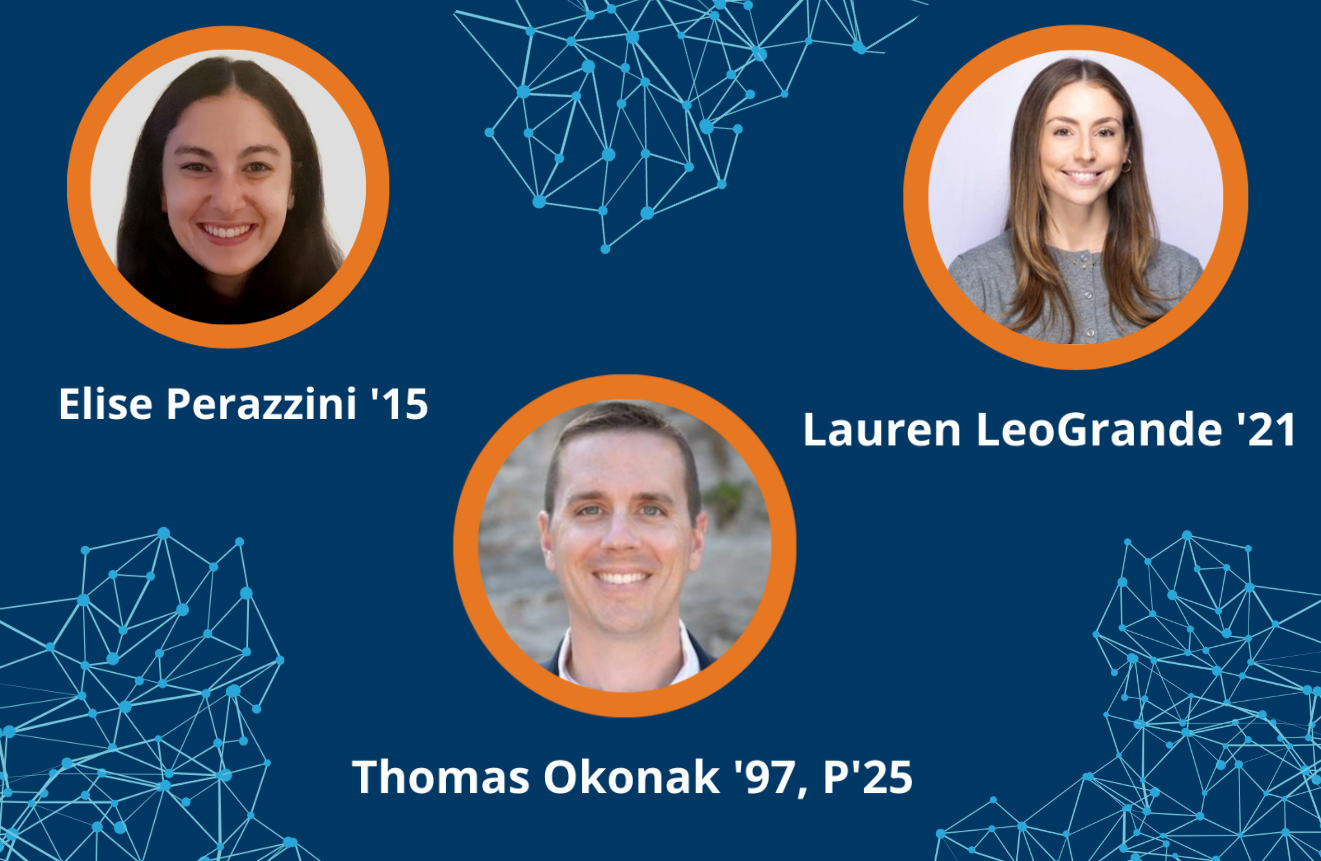
Data Science Alumni Career Panel
By Austin Carroll ’26 Three Bucknell alumni working in data-focused roles—Elise Perazinni ’15, Lauren LeoGrande ’21, and Thomas Okonak ’97—joined Professor Kelly McConville, Director of the Dominguez Center for Data Science, for a virtual panel discussion…
-

LEAF-Writer Wins the 2025 Rahtz Prize for TEI Ingenuity
The 2025 Rahtz Prize for TEI Ingenuity was awarded to the collaborators of LEAF-Writer! LEAF-Writer is a component of the Linked Editorial Academic Framework, the first U.S.-based installation of the virtual research environment. The development of…
-
![Rachel Sweeney standing at a podium, speaking and gesturing to a screen that reads, "[Real] electronic messages between meta employees."](https://datascience.scholar.bucknell.edu/files/2025/10/IMG_3544-scaled.jpg)
AI in Scholarly Communications: Risks, Realities, and Potentials
On Monday, September 29th, 2025, Rachel Sweeney (Scholarly Communications & Copyright Librarian) led a lecture and discussion with a group of faculty and staff around artificial intelligence in scholarly communications. This event was co-sponsored by Bertrand…